HealthRise
Product Designer
4 Designers : Academic Industry Simulation
3 months

Snapshot
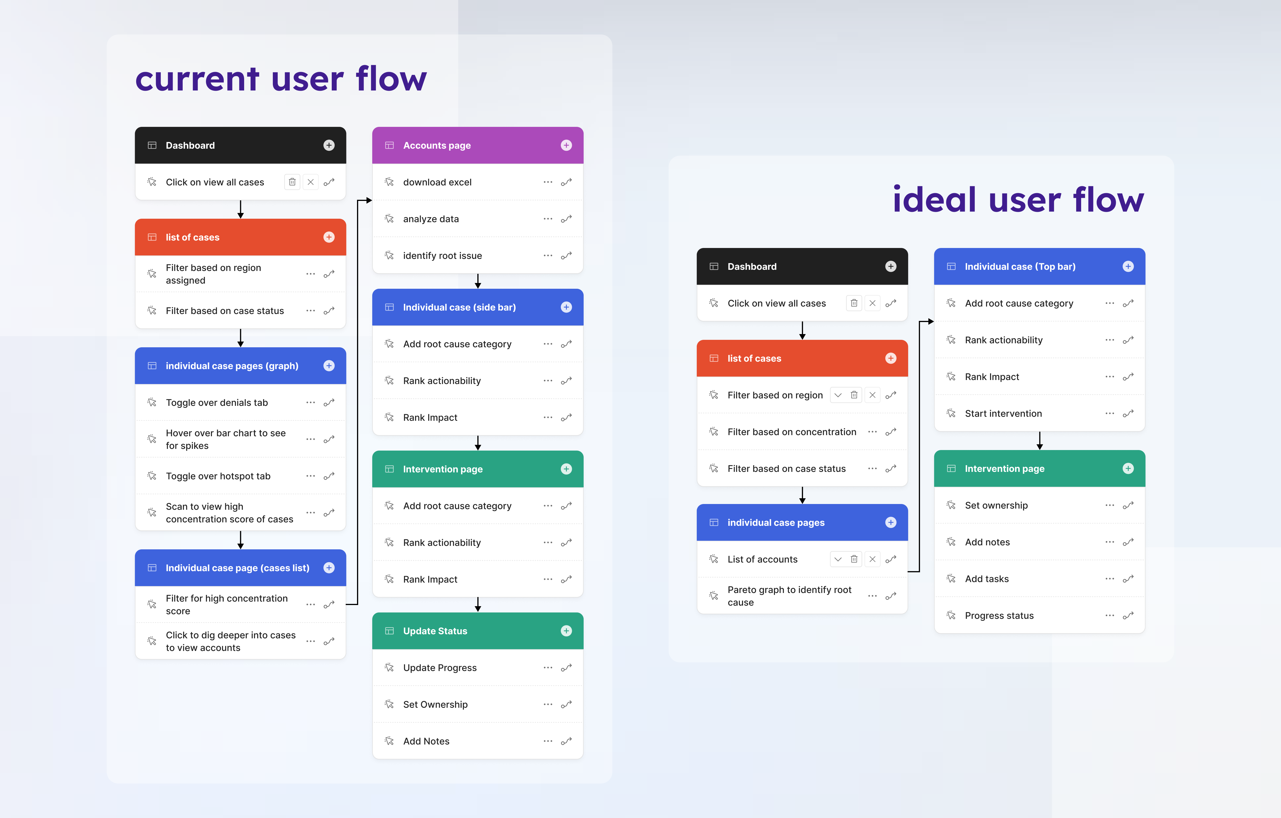
HealthRise’s Denials Navigator was data-rich but workflow-fragmented. Revenue cycle analysts relied heavily on Excel and Epic to complete everyday tasks, leading to context switching and inefficiencies. I redesigned the platform to reduce cognitive load, align with analyst mental models, and shift the product from static reporting to an actionable analytical workspace.
Core Problem
HealthRise’s platform was data-rich but workflow-fragmented.
Analysts relied heavily on Excel for flexible filtering
High click density increased interaction fatigue
Financial impact metrics lacked clear visual priority
Static dashboards disconnected from case actions
Frequent context switching to Epic slowed decision cycles
The system supported analysis, but not execution.
Approach
Strategy
Conducted stakeholder and analyst interviews to map real denial triage workflows
Audited existing flows to identify interaction fatigue and hierarchy breakdowns
Reframed platform from “reporting dashboard” to “operational analytics workspace”
Prioritized high-dollar denial identification and faster intervention cycles
Aligned redesign with goal of reducing Excel dependency
Interaction & Systems
Re-established dashboard hierarchy to surface financial impact first
Converted static charts into clickable drilldowns for direct case filtering
Introduced Excel-style filtering patterns to match analyst mental models
Consolidated filter panels to reduce repetitive manual input
Redesigned cases table for faster triage and column prioritization
Simplified intervention flow with clearer CTAs and progress indicators
Standardized interaction patterns across dashboard, case view, and workflows
Execution
Leveraged and extended existing design system components
Designed scalable layout patterns for dense, data-heavy views
Delivered interaction specs for filtering states, hover states, and drilldowns
Ensured accessibility improvements across complex data tables
Visual Evidence
Impact
Projected impact based on workflow modeling and usability benchmarks:
32% reduction in clicks to identify high-dollar denials
28% faster filtering and triage completion
22% improvement in task completion speed during usability testing
Increased in-platform intervention completion
The redesign shifts Denials Navigator from passive reporting to an operational analytics workspace.